Tuesday, December 3, 2013

Pitt Rivers Museum, Oxford.

For an art trip, we went to see Pitt Rivers Museum in Oxford. I found that museum very unusual and quite odd, mainly because I didn't expect to see so many items and artwork, from different countries and cultures of the world, in one place.
Here are some photographs I took there; 


 Although blades, swords and weapons are not really related to my theme, I really found them interesting, because back years ago, people used to create such unique swords etc. each crafted with individual details and styles, making the weapon practically a piece of art.

When walking around the museum, I also realized that Chinese and Japanese ornaments, drawings etc. may be very useful for me, because over the week where I have done various experiments, I found Gael Stack my favorite. The main thing about Gael stack is, that she uses Chinese art in her artwork, whereas i haven't but possibly could.


This also grabbed my attention, mainly because it reminds me of Easter in Lithuania, where people boil eggs and then decorate them either with paint, or natural materials, like onions, herbs etc. Then they have a game, where each person picks there egg and then everyone has to hit the tops and bottoms of the eggs with other eggs, and the persons who's egg doesn't crack wins.  It seems quite personal to me, because it reminds me of  my culture and traditions.


Monday, November 18, 2013

Artist research - Andy Chen

Andy Chen is a artist from China, several times Chen has a Master of Arts from Guang Zhou Academy of Fine Art. He has also had exhibitions in the academy.Chen does contemporary art, printmaking, painting and other type of art. In his various work Chen uses a wide range of media, such as; oil, acrylic paint, watermark paper, charcoal, wax, wood, sometimes even glass etc.
Chen isn't really a well known artist, I found his artwork on his personal blog, there is really vague information relating to him or his work. Also on his art blog where he uploads his artwork, I have noticed that he doesn't always write down the media, year or the name of his work, however here are some images of his work bellow; 


(Inspection 2, painting on paper)


(Quest, wood, acrylic paint, oil, paper)

(Unnamed painting, 2012 - 2013, mixed media on paper was used, such as tea, coffee, mud, plants and other organic materials)


Maybe it isn't the best decision to research and look into a not so well known artist, who's work information is hard to find, but there is something about his style of work that I really enjoy observing, and it kind of amazes me, so it would be a shame not to try to analyse his work or work in his style, as I like it a lot.
I think the reason why I like his work, is because he uses a huge variety of media and creates textured 2D and 3D pieces, and they aren't too complicated either, this just shows how something can look good and impressive, without the need to overdo the artwork.

Out of all his work my favorite work is a painting called Melancholy 01, and it is made using Acrylic paint, Glass, Wood, hessian etc. Personally I find glass and wood quite unusual for a painting. 


Although it is considered a painting, to me it looks a lot like a mixture of a collage and assemblage, as individual parts, like the wooden frame and the use of hessian, seem to make the art piece appear more 3 dimensional, as it just doesn't seem flat surfaced. Also the way the pieces of material/media are closely layered on each other etc. make it appear more collage like, rather than a painting. The curvy, freehand lines and the curved and somewhat linear shapes, compose the piece to emerge more soft edged and unpolished.  i really like how Chen has made the painting look rustic and old, maybe slightly retro as well. I think it also comes down to the well organised composition of this piece, the way he balances out the eye with the human body image on the painting, helps, as it doesn't create the feeling that there is too much going on in the same place.  

Through out his work, Chen never uses artificial or bright colours, instead he uses more earthy and natural looking colours , that make his work appear more organic, tarnished and  rustic. Mostly he chooses between secondary colours, such as medium brown and dark brown colours, such as raw umber, fallow brown and hints of burnt umber, as well as white and black tones, to darken and lighten areas of the painting. I think the concept of his work being so "natural" looking, can relate to my work, as my environmental theme is suppose to be more natural and organic looking, as it is suppose to relate to nature. And Brown does have an associations with the earth and the natural world.


Not only does he choose the right paint colours, Chen also chooses fairly natural looking materials, that are also quite brown toned (e.g. hessian,wood). These materials also help to create texture and depth.  Like the hessian seems to look quite bold, rough and scratched on the painting, especially when there has been dark brown paint applied. This gives both the effect of gradual tonal change, that blends well with the image, and enables the painting to look more rough,uneven and coarse.

It's hard to explain or even know the reason and meaning of the piece. For some reason when I observe this painting, I see and imagine a person(being the human figure) looking up to the sun (round eye) which is shinning bright (with the light being the whiter and lighter section of the painting), the hessian as the sky and the white/grey paint part as mountains.
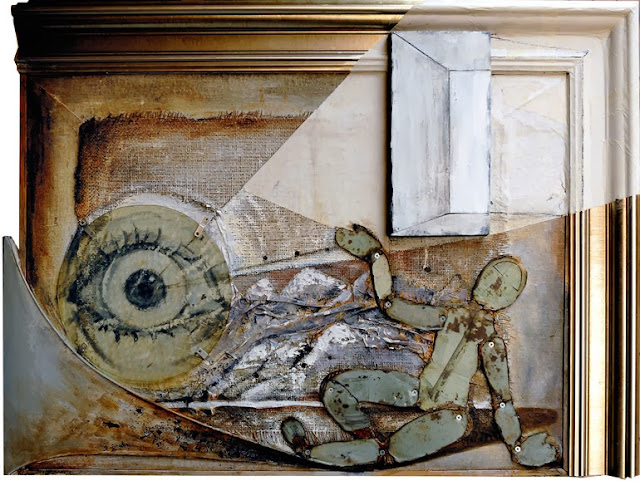
This may be completely wrong, but then again, everyone sees something different when they look at a piece of art.
Here I have done a quick annotation to sort of show what I mean.


I did also look up the meaning of the name of the painting " Melancholy" and I found a few meanings; A constitutional tendency to gloominess or depression. A sad thoughtful state of mind; pensiveness. So possibly the artist was trying to express what he was feeling at the time, or maybe it was just that the painting was suppose to represent that state of sadness or depression. Even so I still see the painting as something more positive than negative.  
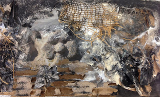

I have already began working in the style of chen in my sketch book, tyring to use similar media, that the artist would use. Here are some images


Saturday, November 16, 2013

Artist research - Gael Stack

Gael Stack is and American painter, she is also a full time professor at the University of Houston since 1974. Stack's work is very unusual compared to other artist that I have researched, at first sight when I seen her work, it reminded me of scribbles and drawings made in a maths books, during a boring lesson. However her work is far more ineradicable and interesting. In her work Stack uses fragments of images, words, drawings etc.and she layers them to create a final piece. 
Here are some images of her work bellow called;
(Forty-one songs #10, ink, graphite, coloured pencil on vellum, 2010)(Forty-one songs #31,ink, graphite,oil, coloured pencil on vellum, 2010). 
I have noticed Stack usually uses a variety of mixed media in her work.


I really like Stack's work, because it isn't flawless or neat and perfect. Instead she scribbles over the top of her work, draws other things over her drawings, and even messes up her image by leaving smudges and fingerprints etc. She isn't afraid to be expressive or different. It also seems like she is inspired by Chinese art, as in some of her work I have seen Chinese style drawings, like in the first image of her work in this analysis(Forty-one songs #10)
One piece of her work that I will analyse in more detail is called Forty-one songs #19, 2010)

When looking at this image with the squared paper , this is what I meant by saying it reminds me of a page from a maths book. In this work, she once again uses a range of mixed media like ,ink, graphite, colored pencil on vellum. The variety of different media makes her work more lively and vibrant.
What I really like about this image is, how it is quite plain and uncomplicated with fairly thin and simple (birow etc) lines, but because they are bold, the whole image doesn't actually need a of stuff going on to appear defined or intriguing. Stack uses a variety of shapes, some are quite sharp, whilst other are linear.

In the majority of her work Stack adds black tones(with graphite) to make a specific subject/image stand out more than others. However in this piece of work, there isn't something that is really strongly  overpowering other images, it seems quite balanced out. 
Possibly just this part of the drawing (image bellow) that is darker than the rest of the work, when I look at this piece of work It does grab my attention more than the rest. Although not for long as I get distracted by other parts of the composition.
Colour wise the artist uses a lot of blue, red and orange shade/colours as well as some black for tone. I like that these colours are never too bright or intense, so they don't create a dramatic contrast or give the image a synthetic look.

I think Stack created these pieces of work to show a different way of being expressive. Also to show that art work doesn't have to have an expectation of being ideal, perfect and neat. It can be very beautiful in a completely different way, people just need to realize and know how to look at it, to understand the feelings of the artist.

I could interpret this work to my theme (environment) by just doing sketches of different things I see/observe outdoors, possibly indoors with natural organic materials too. 
I have already done some work in the style of Stack in my sketch book. Here is an example of one of my drawings that I have done. 


Artist research - Emily Leonard

Emily Leonard is a full time American landscape artist, from Tennessee. Most of her subject matter concentrates on observational paintings of trees,forests and empty roads. Her work style is somewhere between representational and abstract art. Although Leonard uses a variety of mixed media, her main media is oil paint. Here are some of her paintings bellow.

(Under tender limbs buds will start to gather,mixed media on gessoed paper, 2009) (What You Whispered Keeps Me Satisfied, oil 2005) (Tyne Boulevard / I know I should go,oil, 2006)


The reason I like Leonard's work is because she looks at everyday things like a trees, that most people don't really take notice of or they find trees to common and boring, and she creates something very beautiful and expressive through the use of the right colours, shades and brushstrokes. She does't even always try to create photographic or realistic paintings of landscape or nature, she just goes with how, what she is observing is making her feel, and reveals her feelings and thoughts through expressive, momentary and prompt sweep of the paintbrush. It is quite easy to tell this when observing her work, as she often leaves clear brush stroke lines on the paintings. 


In a interview Leonard has said "My process and practice mimic these movements: I break down an image and build it back slowly with hundreds of washy layers, glazes and gestures.... I want them to come upon the viewer as such – slowly and intimately, as if the viewer feels like he found this image instead of me. I want to get at the experience of being in your body in a place. Rather than painting the tree out the kitchen window".

One painting that really makes me imagine what it feels like being at that place is "Follow That Lonesome Roadside, oil, 2006"


When I look at this image I straight away think of a freezing winter evening at sunset, that makes me shiver. At first it's mainly because of the dark blue road that looks like it is covered in thick layers of ice, and the leafless trees all in the open, with only evergreen trees that create a shadowy and and gloomy atmosphere. The use of darker oil paint colours, like O-H blue deep together with burnt umber and green umber, creates a very cold, isolated and lonely feeling. As if indicating that the darkness will overrule the fading subtle sunlight, that adds some kind of warmth to the cool atmosphere. This may be due to the use of the dark shades of brown(burnt umber) creating darker tones that make the sky(napels yellow extra) look very gentle compared to the rest. Also the yellow((napels yellow extra) sky and the dark O-H blue deep road stand out well because yellow and blue primary colours compliment each other. The overall use of colour creates a harmonious effect to the whole image.


In her work Leonard uses natural and slightly blurred lines, to create blurred edges and smoothing boundaries, these with the help of graduated tone, add depth to the painting. Making it appear gloomy and faint, as well as more 3D.
Another way of how Leonard builds up depth  and modifies colours in her painting is trough glazing. Which is done by applying thin translucent layers of oil paint over and over each other. 

I think Leonard creates this kind of art work, because she sees beauty and is fascination in nature. She wants to express and share how she feels about something she finds amazing and calm, through painting it out so people could experience and understand what she has felt , maybe even remind them of something, or somewhere they have been or seen before. She doesn't just want the viewers to see her work as a "painting of nature" and nothing else, she wants them to use their senses and travel to that moment to imagine what it's like there etc. Because personally I find her work to be tranquil and peaceful.
I believe her work is very easy to relate to my theme as I am focusing on the environment and nature. And Leonard's landscape paintings have given me ideas and inspiration. I have already done work in her style, here are some pictures of my drawings etc. 


Sources
http://www.emilyleonard.com/